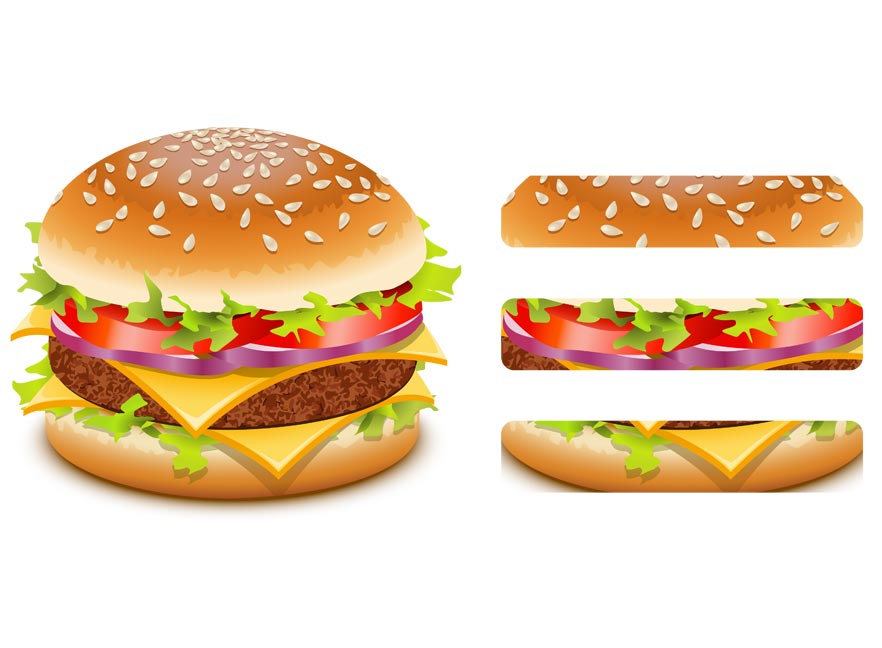
If you have a phone or tablet, you likely interact with hamburger menus on mobile-friendly websites regularly. With the exponential growth of mobile users, websites need to condense their menus into much smaller screens. As an integral part of responsive web design, the hamburger icon is a universally accepted flyout menu that minimizes website navigation into three stacked bars to improve the mobile experience.
There has been a lot of debate around the hamburger menu as some web designers argue that it deters users from digging deeper into your website because “out of sight is out of mind”. Still, others argue that it forces visitors to tap one extra time, which is more work causing navigational friction. Furthermore, some less tech-savvy website users might be unaware that it is a menu icon. However, that issue is easily solved by labeling it.
According to our Google Analytics data, over 20% of our users interact with our hamburger menu so it may not be so flawed after all. There are many ways to design your mobile menu. Below, we have animated our favorite hamburger menus from some of our recently launched responsive websites so you can get a better idea.


If you do not have a mobile-friendly website because you think that your users are not accessing it with mobile devices, it could be that they are just exiting out of navigational frustration. With Google penalizing mobile-unfriendly websites and mobile users having exceeded traditional laptop and desktop users, you need to convert to survive the mobile revolution before you get buried by your competition.

