Herding website visitors is like herding sheep. They never do what you want them to do. They abandon their shopping carts, they don’t read your blog post entirely or they leave if your homepage fails to impress them in the first 2-3 seconds. Just like you need a Border Collie or Aussie Shepherd to herd sheep, you need a call-to-action to effectively herd your website visitors.
A call to action (CTA) is a button that tells your visitors what you want them to do next moving them down your sales funnel. According to Entrepreneur, an astonishing 70% of small business don’t even have a call-to-action on their website. CTAs are usually placed where people are looking like the top navigation, over their homepage banner or at the end of a page. Examples of CTAs include asking prospects to subscribe to email marketing, register for a webinar, add to cart, browse products, request a demo or provide their information for someone to contact them.
Friendly & Active Verbs
Avoid boring, conventional wording like submit, sign up and subscribe. Opt for more friendly and active verbs like “Let’s Do It!” which is both compelling and exciting even if your products and services may not be. Instead of just asking people to to “subscribe” to your newsletter, you can ask them to “be awesome” like we have done in our footer. Using “Talk to Us” or “Let’s Chat” on your contact form is far more approachable and welcoming than “Submit.” Promote enthusiasm with a CTA like “plan your dream vacation today!” to spur someone to book their family trip. In addition, an exclamation mark can give your CTA the boost it needs to convert more prospects.
Contrasting Colors & Visually Enticing
Green and orange buttons are proven to stand out more than the other colors. However, they only work well when paired with other contrasting colors. A green CTA on top of a green background or another color of similar intensity would blend in and easily get glanced over. For example, a dark green button on top of a light grey background (different intensity) would stand out much more than a dark green button on top of a dark grey background (similar intensity).
Large but not too Large
How large is too large and what is gaudy? Although it is crucial to establish a clear hierarchy of content, people view CTAs with overly large lettering to be screaming at them and thus, threatening. Button text should be no larger than 16-20px and smaller on mobile devices as there is a fine line to being too big.
Clear, Specific & Simple Button Text
Button text should never go on and on. Two to four words work best and should contain specific action-oriented text like “Get my free demo” or “Start my free trial.” Buttons need to be scannable and understood in a split second glimpse because no one ever reads website content.
Use the Customer’s Voice
Visitors are more likely to convert if you put yourself in their shoes when creating CTAs. So Instead of “Start your free trial,” try saying “Start my free trial” the next time you do A/B testing. This very subtle difference can have a big impact.
Create Urgency & FOMO
Use persuasive content coupled with fear of missing out (FOMO) to drive urgency, a sense of limitation and a sense of potential loss by triggering feelings of greed and panic. Incorporating a discount and using words like “limited time offer” and “act now for 50%” off is tremendously effective.
Only Feature One Main Call-to-Action
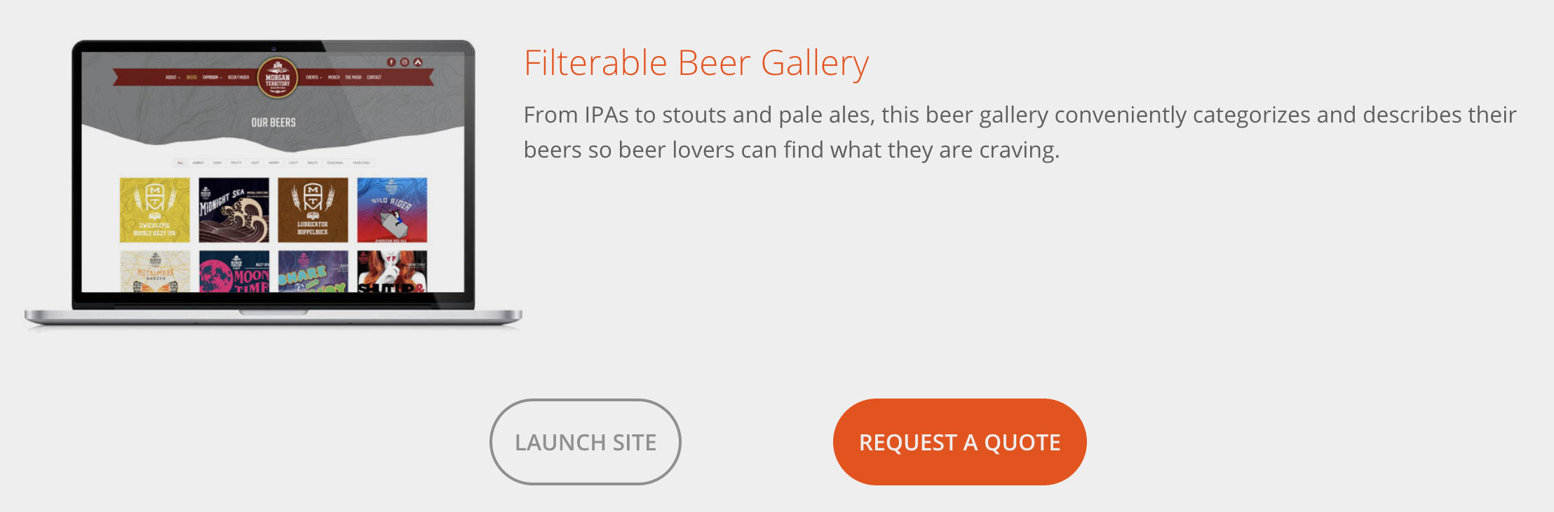
Oftentimes, you may have more than one CTA but you should only highlight one. If you give your audience too many choices, they may get paralysis by analysis and do nothing. If you checkout our portfolio, we practice what we preach because we have CTAs for going to the live site and requesting a quote. Obviously, the quote CTA is far more important which is why we styled it to grab more attention.
Integrate Value Proposition
A value proposition answers the question of “why” someone should endorse your products or services. It is a promise of value to be delivered, communicated, and acknowledged and how the value (benefit) will be delivered, experienced and acquired. Simply put, it describes your target customers, the problems you solve, the needs you address, and why you are better than your competition. Some of the best value proposition examples include “Uber – the smartest way to get around,” “Apple – the experience is the product” and “Slack – be more productive at work with less effort” If you clearly articulate your value proposition before presenting your CTA, it can dramatically increase conversion.
Ample White Space
By maximizing the white space around a CTA, you are minimizing distractions so the CTA grabs their attention and more effectively converts them. Negative space gives your users tunnel vision so you can manipulate them into doing what you want.
Manipulate Prospect’s Desire to Solve Problem
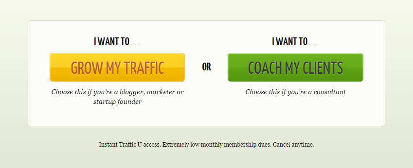
This strategy goes hand-in-hand with writing in the customer’s voice. Put yourself in your customer’s shoes and compose CTAs based on what they want your products and services to do for them. Quick Sprout does a great job of manipulating their prospect’s desires to solve problems by starting their CTAs with “I want to…”
Establish Trust
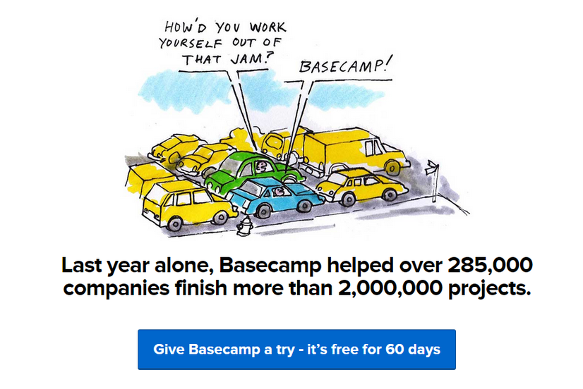
No one wants to buy from a faceless corporation. Customers want to buy from a team of passionate people so it is crucial to establish trust by sharing success stories and / or highlighting well-known brands you work with like how Basecamp does in this example below. It is important to note that their CTA is a bit wordy and we would have rephrased it more precisely like “Try Basecamp Free.”
Left or Center Positioning
We tend to read top to bottom and left to right so CTAs on the left perform better than ones on the right even fi they are further down the page. Surrounding design elements, imagery and videos can draw attention away from from your CTA.
Wrapping it Up
If you are a small business who needs help with your prospects not converting, implementing CTAs, or anything to do with WordPress websites, please contact our San Francisco development team.