The web has evolved a lot over the last two-plus decades but some longtime web designers and developers have remained set in their ways. Sure I don’t see them being out of work anytime soon but it is it is important to keep abreast of the trends. I remember graduating in 2005 in graphic design only to find that there were very few print design jobs out there because the web was making all of them obsolete. However, even today, there are still colleges churning out graphic design majors like there is no tomorrow despite the bone-dry market. Thus, here are some very noteworthy, game-changing trends to remember when you are cranking out your next Photoshop mockup or mobile-friendly website.
Responsive is a Must
A responsive website is a website that automatically adjusts its layout for optimal viewing based on resolution to ensure the best user experience possible. With mobile browsing surpassing traditional laptop and desktop browsing in 2015, its go responsive or go home. The 960px grid and grids, in general, are more important than ever when designing websites so that the different columns of the laptop version can be easily stacked for mobile viewing. Because responsive websites significantly improve user experiences, Google also ranks them better than traditional websites and even mobile websites.
Colorful Full-Page Images with Ghost Buttons
With the rise of flat design over the last couple of years came ghost buttons. A ghost button is just a call-to-action surrounded by a simple white button outline reversed out of striking high-contrast background images. They grab your attention without overwhelming the design and messaging. These buttons are larger than traditional buttons and are very prominent on the page. They can be accompanied by simple geometric icons and can also become non-transparent on hover.
Due to the rise in minimalistic design and ghost buttons, it is more important than ever to invest in powerful, and elegant images that can only be achieved with a professional photographer. Now it is the best time to ditch those cliché stock images.
Shallow Navigation & Scrolling
A menu with tons of dropdowns or even clicking, in general, is not appropriate for mobile viewing because navigating on a smartphone is intrinsically more difficult. Usually, dropdowns on mobile mean that users have to click to view those submenus making them less accessible. A shallow menu structure is recommended so that users don’t get lost or frustrated and leave while browsing. Content is more discoverable with it is not buried under multiple categories. If you must use deeper hierarchies, it is best to provide shortcuts and links that lead directly to the lower levels. With people clicking less and scrolling more on mobile, it is best to structure information at the page level which is why card design has also been on the rise.
Card Design
Card design is the re-architecture of the internet, away from pages and clicks, towards unified experiences by combining many pieces of content. Content being broken down into digestible chunks and re-aggregated is the result of the rise of mobile devices with tons of different resolutions and screen sizes. Cards can come in all kinds of shapes and sizes, but commonly they include information such as a title, a user name, a picture, and various icons like tiny, condensed webpages. Sometimes there might be a little bit of text, for example, a product description. The modular layout created by card design can be molded into different sizes based on your device’s resolution. Although Pinterest was one of the early adopters, all the huge web moguls like Google and Twitter are following suit.
Material Design
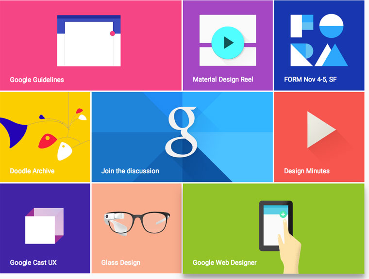
Material design is a design language developed by Google for Google, Android and Chrome announced at the Google I/O conference on June 25, 2014. It is basically flat design with subtle gradients, shadows and textures, splashes of bight colors and bold and simple iconography. It boasts one unified system that creates a consistent user experience across platforms and device sizes. Learn more about material design.
It looks like the trends that were prevalent in 2014 will continue to evolve in 2015. We are excited to push the limits of these trends with our new WordPress websites.